Kariyer.net Job Search Application
It wouldn't be a lie to say that the improvements we made to the Kariyer.net brand, specifically regarding its logo, essentially began with the Kariyer iOS and Android applications.
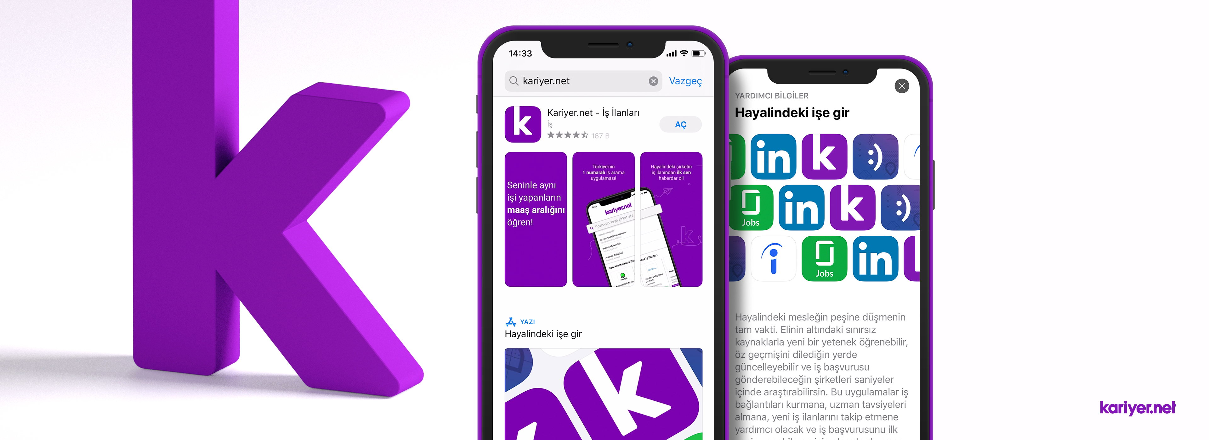
To ensure the mobile app's icon design is memorable and serves as an element reminiscent of the Kariyer.net brand, we based it on the letter "k" and removed the old symbol from the career identity. We also made sure to include supplementary identity rule sets, color palettes, and various concept studies to support this.
With this move, which we believed would strengthen symbolic memorability and brand identity, we embarked on improving the native (iOS and Android) applications in early 2019. These improvements were predominantly focused on product features and fixing the search flow. When we examined the search flow, we discovered that, unlike most experiences we encounter, the technical and design functions were operating incorrectly. The feelings it evoked in the user were far from being helpful or easy; it felt forgetful, clunky, and outdated.
On the homepage, there was no distinction between the post-welcome experience for a new user and that of a returning user. The areas intended to inform the user, along with the home screen, were designed in a way that tied the hands of the product side. From the user's perspective, there were dead, un-updated areas.
NEW DESIGN
I am aware that when you mention a "new design" in companies, everyone's perspective changes, and people might not like the idea, but the interface design desperately needed a revamp. Our analysis revealed the necessity to transform it into a design that speaks to the brand's identity, colors, and functional purpose:)
I would like to emphasize that we divided this process into phases. While implementing these phases, we acted without forgetting that the user relies on this application to find a job, apply for a job, and easily navigate according to their sector and expertise—and doesn't expect much beyond that.
Progressing by building upon the old application piece by piece and observing that those changes worked was crucial for the Kariyer and iLab central product development design office.
Details About the New App
When I tackled the application, I started by removing the most bothersome parts: mixed colors and modules that functionally provided no benefit to the user. Standardizing the font types and the working principles of the modules seemed essential.
If I were to share some of the improved sections that I consider important, though not all of them:
Homepage
- Interaction of similar and sponsored ads with the user.
- Search functionality and suggesting relevant titles.
- Job Posting Suggestions.
- Bottom Navigation improvements and Sticky positions.
- Showcasing the renewed brand identity and design approach to the user.
Lottie Animations
- We delivered the animated logo icon, loading screens, and various elements as Lottie files via After Effects. This ensured seamless usage across various platforms and reduced our workload. ( https://lottie.airbnb.tech )
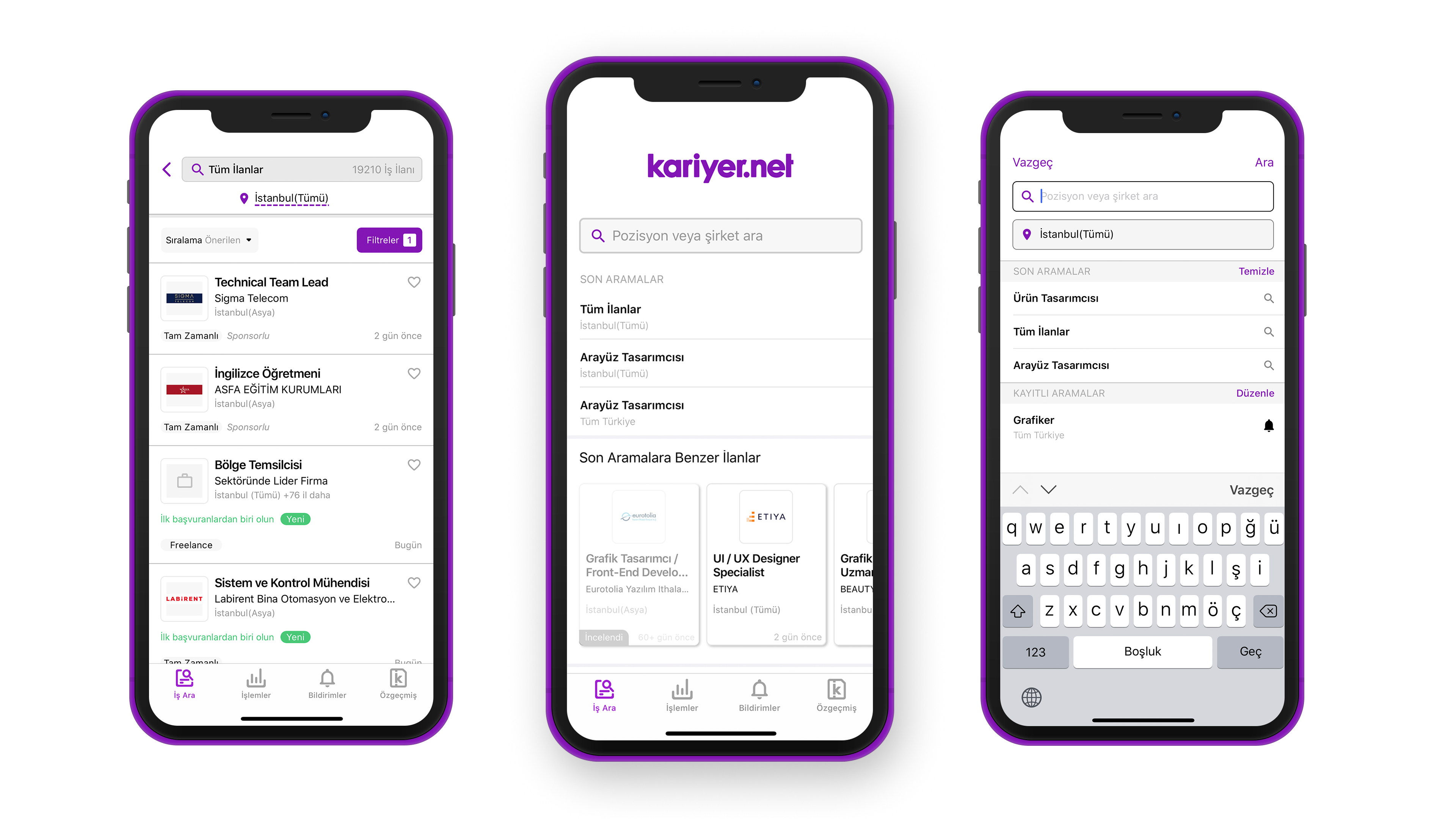
Search
- Providing position and company search results with the location band as a separate Tab.
- Recent Searches and Saved Searches.
- Defining gestures for the keyboard and various native components.
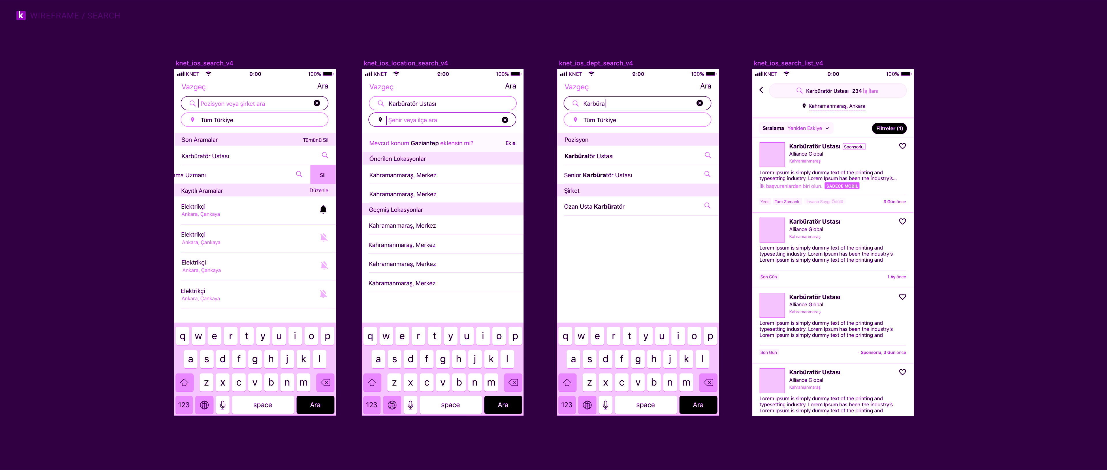
Listing
- Keeping the search bar on the page as much as possible and placing the result information and position accordingly.
- Making sorting and filtering easy and understandable.
- Focusing on card designs so that they don't break when an extra detail is added or removed.
Job Post Detail
- Defining the rules applied to pages with variable content and creating design elements based on these rules.
App Store
- Store concepts were updated based on the new brand identity and established on a standard structure. While determining the principles of this structure, we took care not to disrupt the colors, fonts, and other graphic elements we use. Performance-affecting elements such as text, screenshots, and video preparation were also part of our scope of work.
I didn't handle the design phase of the Kariyer.net app revamp by myself. I would like to thank Türkan Kalbiyeva, whom I thoroughly enjoyed working with, as well as Ozan Can and Ömür Bali for their support.
Türkan and I have been working in great harmony from the very beginning and throughout the ongoing process. The journey where we manage the concept and identity works alongside the apps is well on its way to becoming a valuable asset to the Kariyer.net brand.
The Kariyer.net identity transformation, which began with the Native Apps, is now continuing with the web app. I plan to share more about this in the future.
As the app development processes are still ongoing, certain improvements are continuously required. The timeline of these processes may vary depending on how the changes we make are reflected in the live application on the stores.
The Kariyer.net App on the App Store and Google Play:
https://apps.apple.com/app/kariyer-net-i-%C5%9F-i-lanlar%C4%B1/id574794931
https://play.google.com/store/apps/details?id=com.kariyer.androidproject