Back to work
Martı Electric Scooter Rental App Redesign
Martı is an app I have been using frequently lately, and as a user, I felt the need to make some functional and visual improvements. Looking from a broader perspective at the work that reflects my point of view and includes my personal touches, I asked myself what the top 3 priorities would be and took action accordingly:
- Splash Animation and map user interactions: I tried to convey to users that it is a dynamic and lively application by using more modern lines and colors. I envisioned developing a concept where discounts or various offers could be presented directly through this interface.
Animation: https://dribbble.com/shots/9591566-Mart-App-Redesign-iOS-App-Brand-2
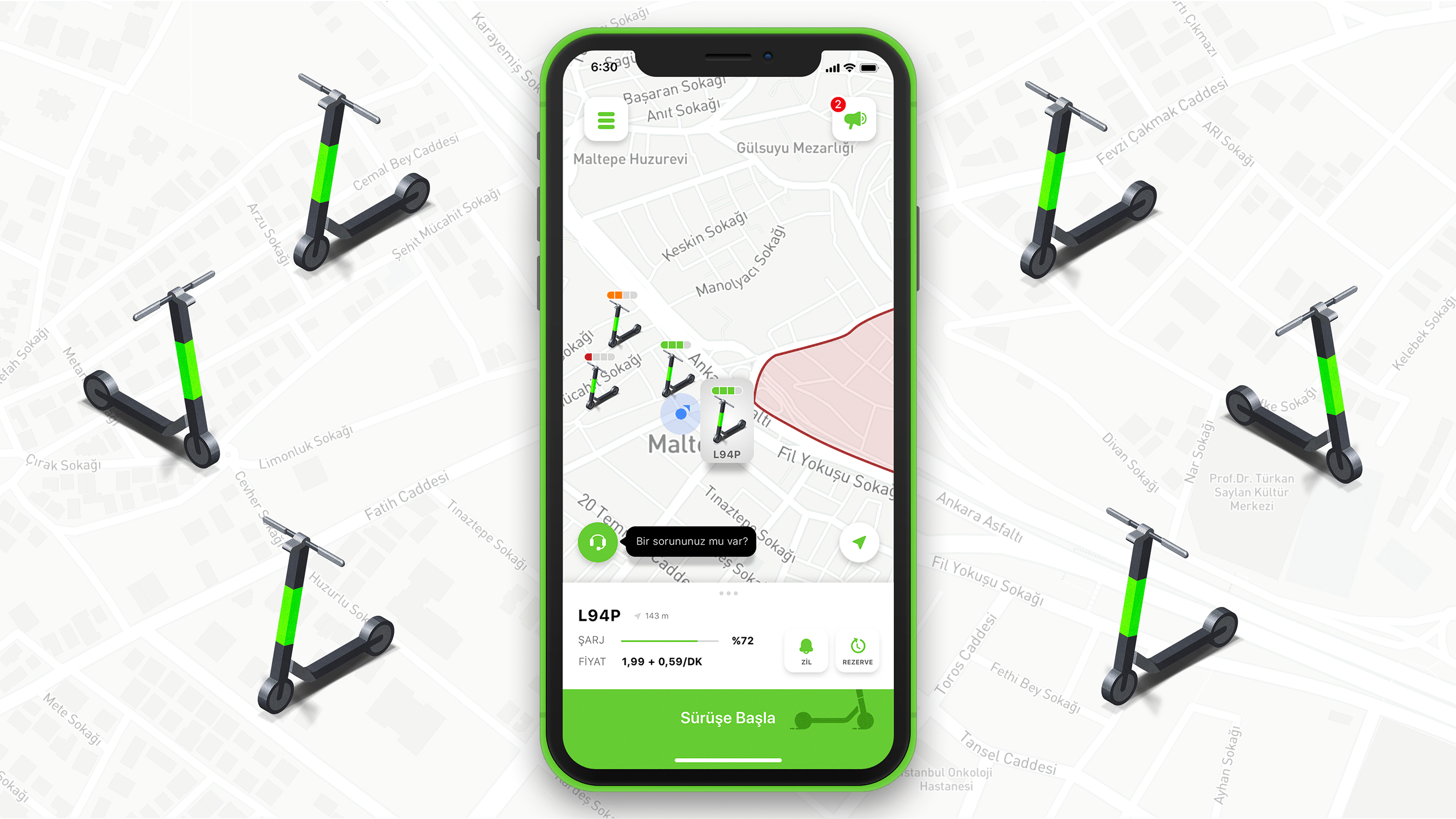
- Homepage: With a structure that automatically assigns you the closest Martı with the highest battery level, you won't have to search around wondering where the scooters are or how much battery they have. I envisioned a homepage that is in constant communication with you.
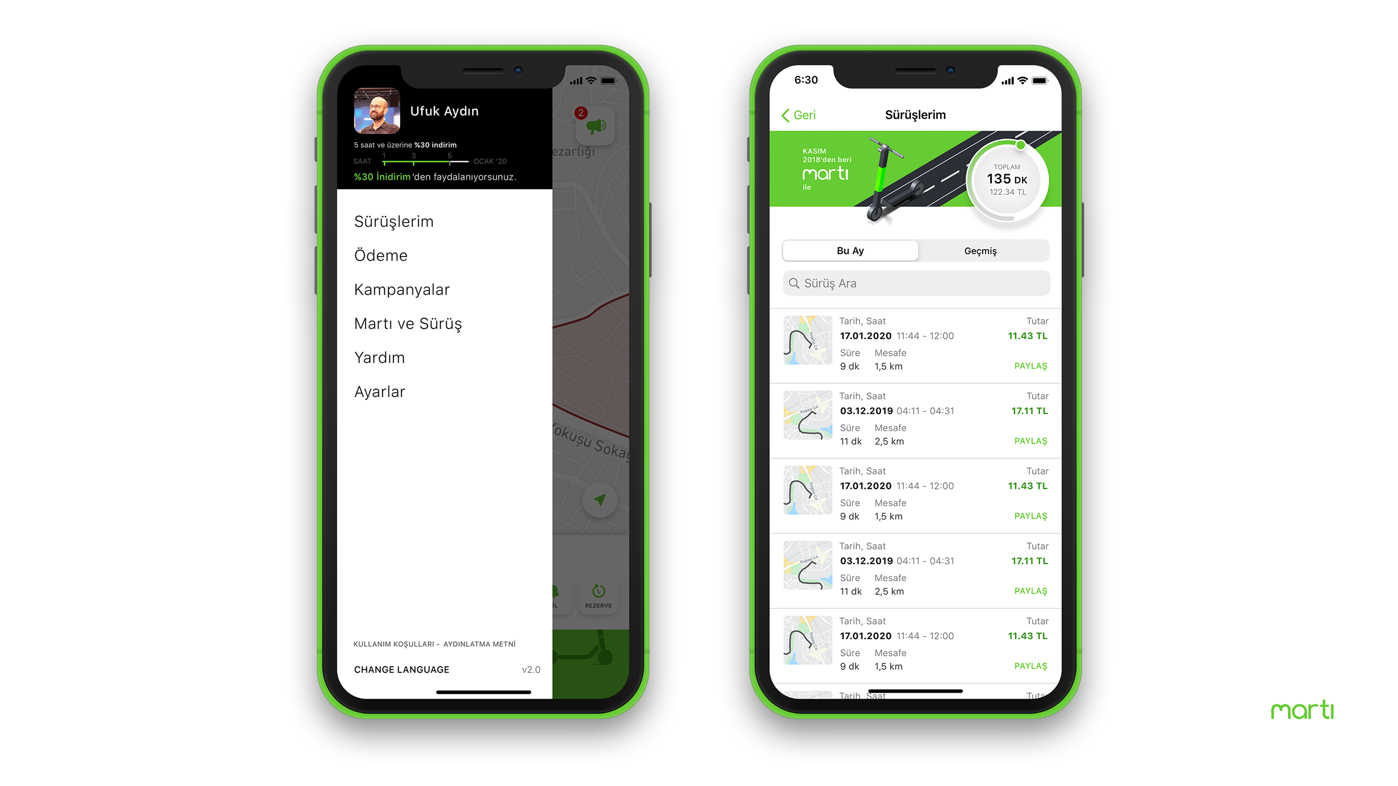
- Menu: The menu interface, which was plain and followed standard patterns like most examples, needed to change. As the simplified menu freed up space, it became a great option for introducing and explaining gamification flows to the user.
- My Rides: I thought it was my right as a user to see my past rides collectively and track how much money I've spent.